Project details
Budget:
No described
Client:
Seedz
Tool:
Figma
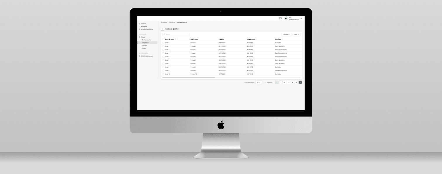
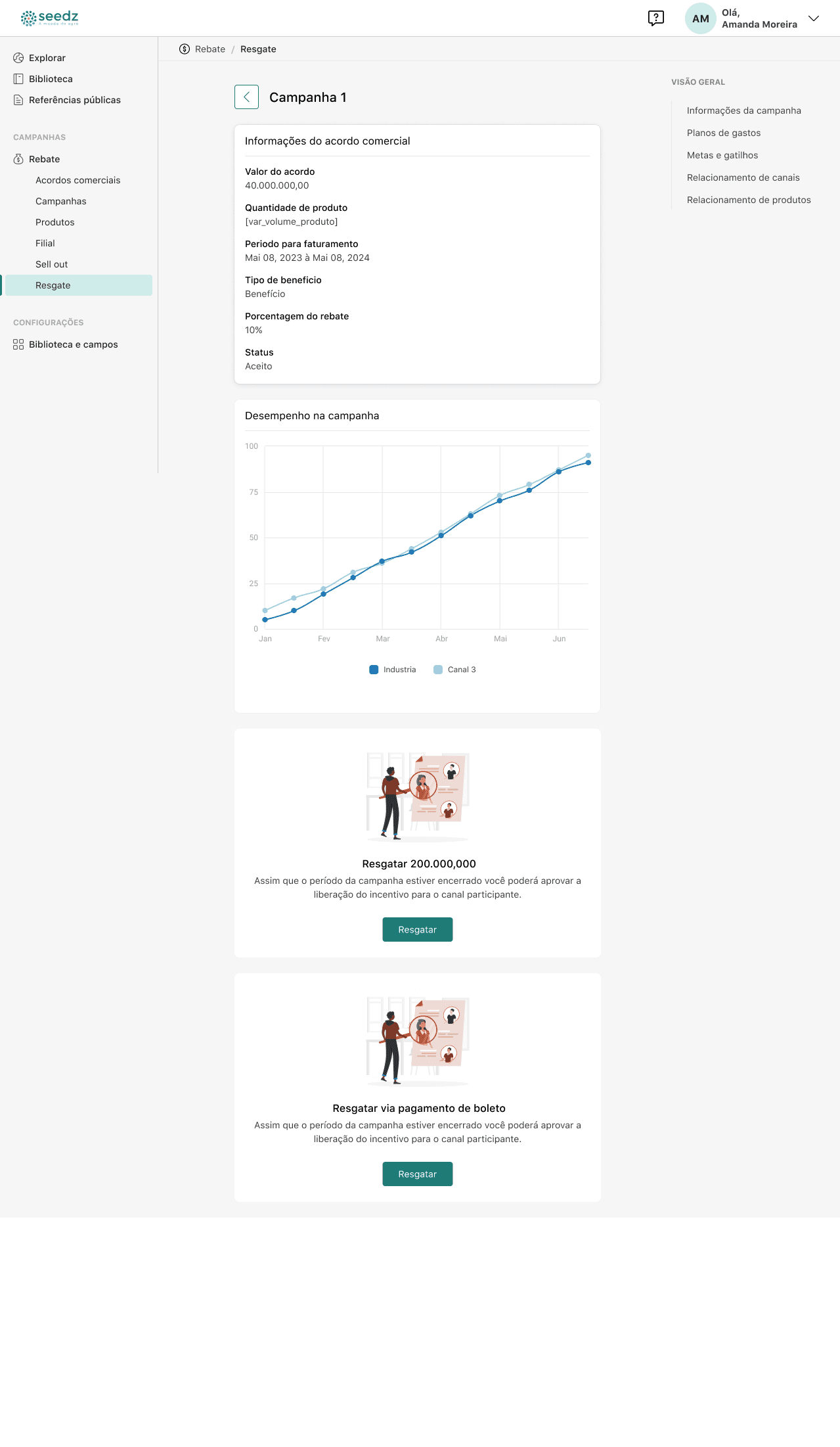
Rebate Dashboard - Agritech Company
Seedz is a Brazilian agtech company that offers a comprehensive digital platform designed to connect various stakeholders in the agribusiness sector, including farmers, industries, dealers, cooperatives, and businesses. Founded in 2017, Seedz aims to enhance efficiency and productivity in agriculture through innovative solutions.
The platform provides a range of services, such as loyalty and incentive programs, business intelligence, and financial services, enabling clients to recognize the value of agricultural entrepreneurs and rural producers, thereby boosting their agricultural business.
By integrating data and technology, Seedz empowers agribusinesses and farmers to make informed decisions, optimize operations, and foster sustainable growth in the agricultural industry.
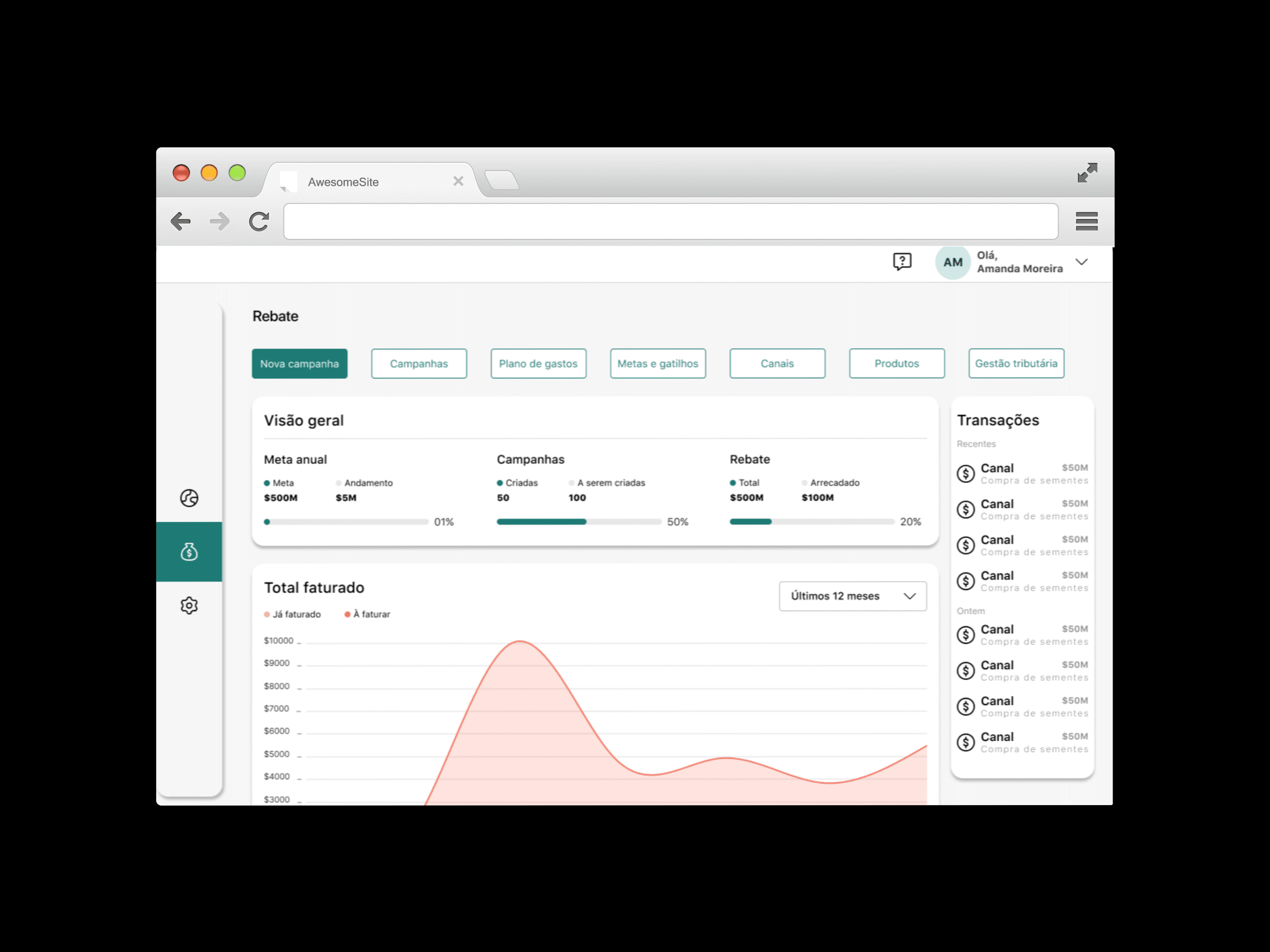
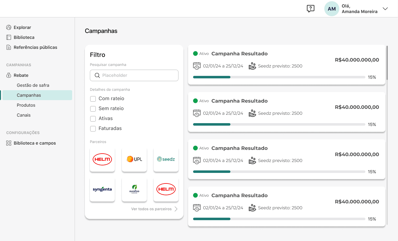
1. The Dashboard building
Consistency is Key
Consistent design elements (buttons, fonts, colors) create a cohesive look and feel.
Stick to a limited color palette and consistent typography.
Clear Navigation
Ensure that menus, buttons, and links are easy to identify and use.
Use familiar icons and labels, and keep menus simple.
Responsive Design
Ensure your website works seamlessly across all devices—desktop, tablet, and mobile.
A mobile-first approach is critical as mobile usage continues to rise.
Minimalism and Simplicity
Keep the design clean and uncluttered.
Focus on essential elements and remove distractions.
Visual Hierarchy
Use size, color, and placement to guide users’ attention to the most important information.
Make sure that call-to-action buttons (CTAs) stand out.
Best Practices
User-Centered Design
Prioritize the needs, preferences, and pain points of users when designing.
Conduct user research and use personas to guide decisions.
Fast Load Times
Slow websites are a major UX killer. Optimize images, scripts, and other assets for faster loading.
Aim for a load time of under 3 seconds.
Accessibility
Design for all users, including those with disabilities.
Implement keyboard navigation, screen reader compatibility, and color contrast for visibility.
Clear and Engaging Content
Use simple language and organize information in easily digestible sections.
Incorporate visual elements (images, videos) to break up text.
Testing and Iteration
Regularly test your design with real users (user testing, A/B testing).
Use feedback to iterate and improve your design.
Conclusion
An effective user interface and experience are crucial to a website’s success. By understanding user needs, habits, and preferences, you can build a smooth and intuitive journey. Continuously refine through testing, make improvements over time, and stay informed on evolving design practices to ensure your site remains modern and easy to use.